PAINT THE TOWN RED
︎︎︎Quietly Studio
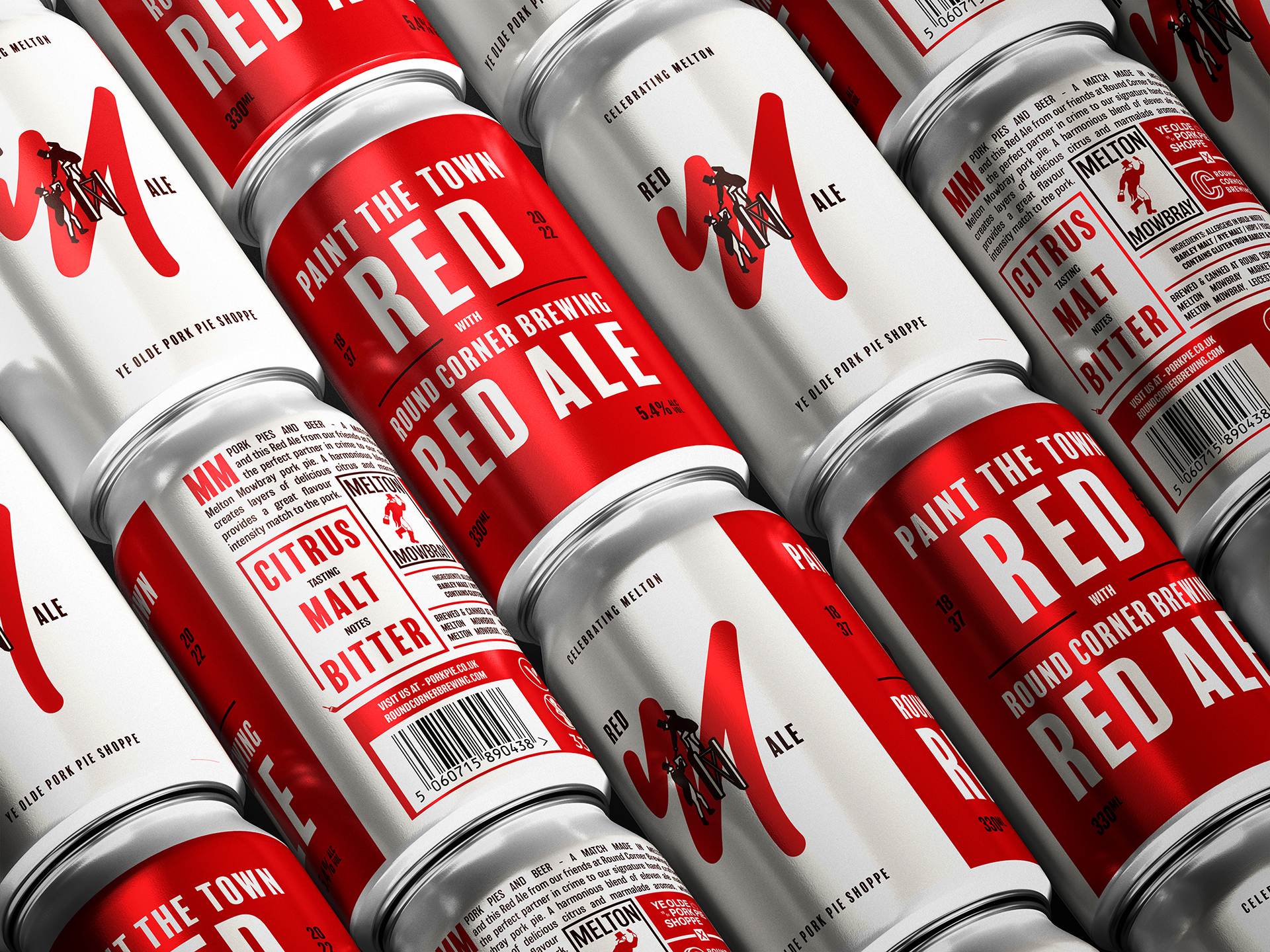
Creating an identity, and packaging series for Melton Mowbray’s ‘Ye Olde Pork Pie Shoppe’ range of local partnerships and collaborations, starting with a Red Ale from a local brewery.
Celebrating local produce and the people who make it, the range takes its name from a drunken night out in 1837. The story goes that the Marquis of Waterford and a gang of his aristocrat friends went on a spree after a few too many at the races, painting the town (and a few locals) with red paint they found nearby. Which as Melton Mowbray townsfolk claim, originated the phrase ‘Paint the town red’.
Celebrating local produce and the people who make it, the range takes its name from a drunken night out in 1837. The story goes that the Marquis of Waterford and a gang of his aristocrat friends went on a spree after a few too many at the races, painting the town (and a few locals) with red paint they found nearby. Which as Melton Mowbray townsfolk claim, originated the phrase ‘Paint the town red’.

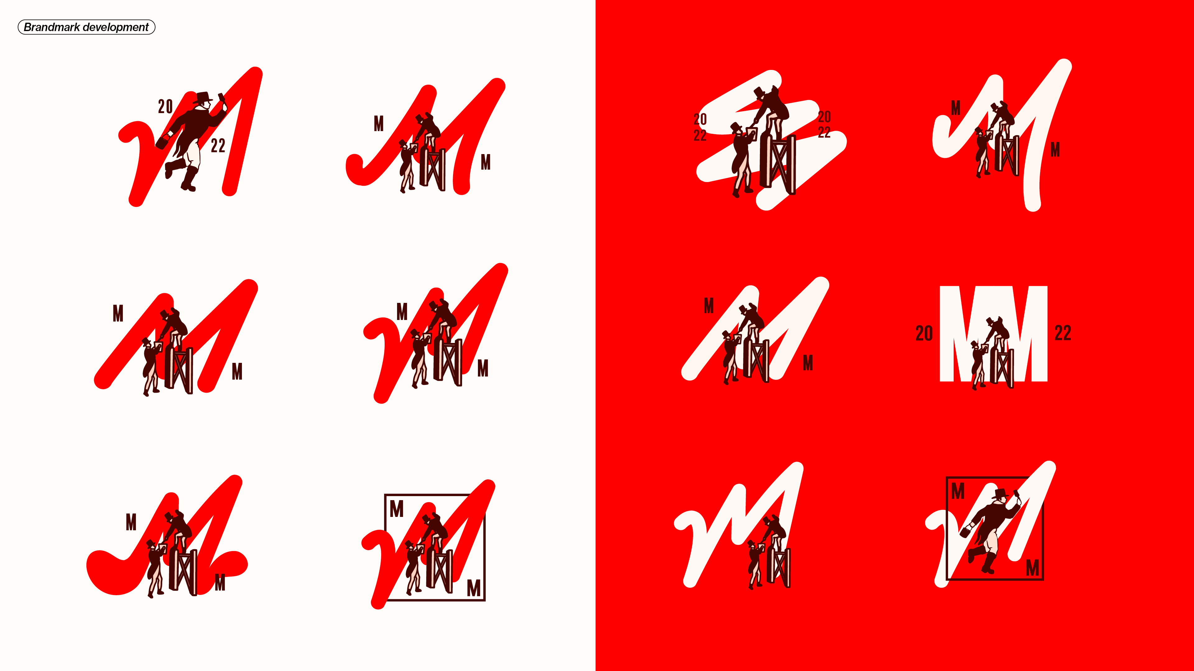
The squiggly mark is both an expression of paint, as well as a hidden M for ‘Melton’.
The duo painting I illustrated based off an artist’s record of the Paint the Town Red incident from 1837.

The design feels celebratory and proud, shouting about the produce on offer in the rural food capital, whilst
retaining a premium, modern take on tradition.
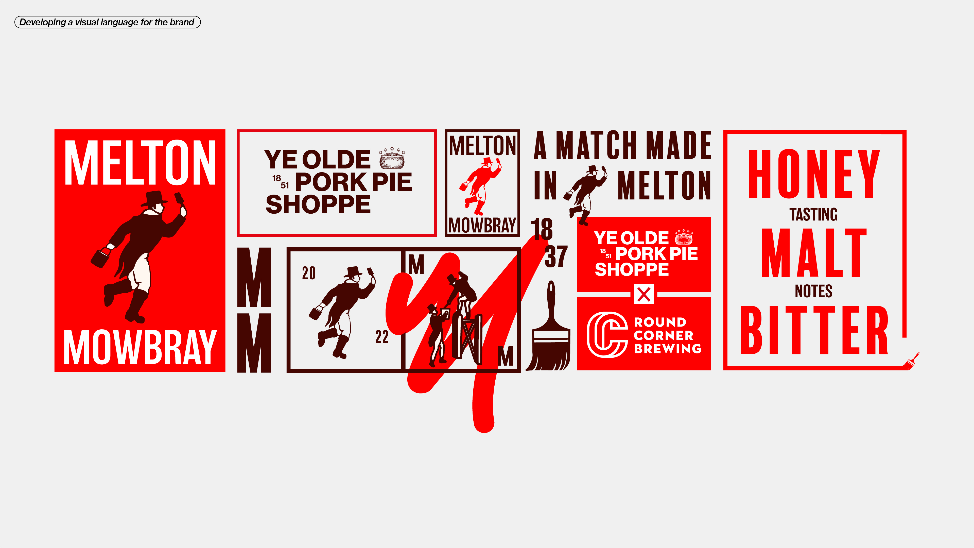
The type layout is inspired by vintage english posters, carrying the energy of a riot poster.


